> ## Documentation Index
> Fetch the complete documentation index at: https://cometchat-22654f5b-docs-angular-v5-docs-update.mintlify.site/llms.txt
> Use this file to discover all available pages before exploring further.
# Incoming Call
> Incoming Call — CometChat documentation.
## Overview
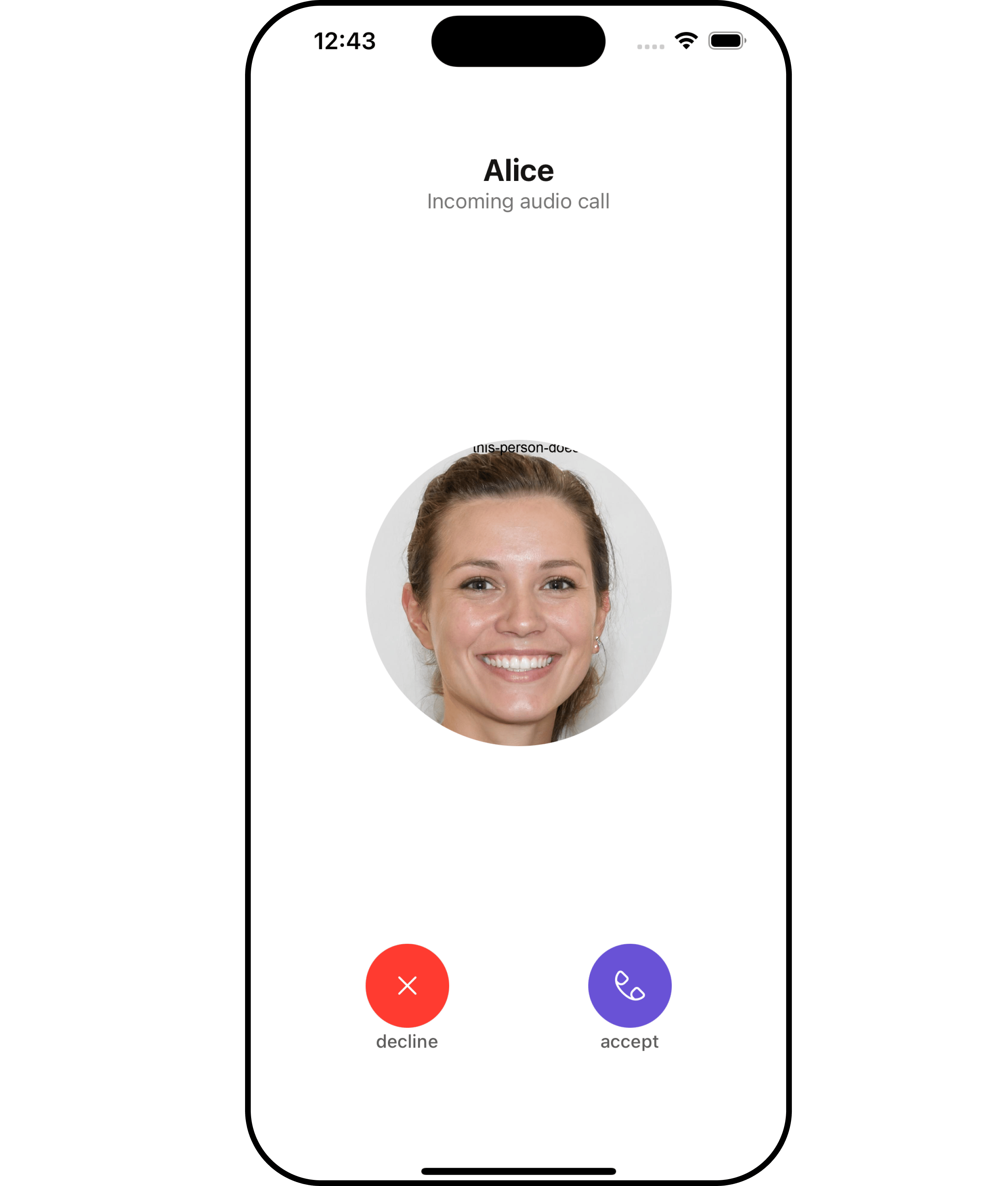
The `Incoming call` is a [Component](/ui-kit/ios/v4/components-overview#components) that serves as a visual representation when the user receives an incoming call, such as a voice call or video call, providing options to answer or decline the call.
 ***
***
## Usage
### Integration
`CometChatIncomingCall` being a custom **view controller**, offers versatility in its integration. It can be seamlessly launched via button clicks or any user-triggered action, enhancing the overall user experience and facilitating smoother interactions within the application.
```swift theme={null}
let cometChatIncomingCall = CometChatIncomingCall().set(call: call)
cometChatIncomingCall.modalPresentationStyle = .fullScreen
self.present(cometChatIncomingCall, animated: true)
```
If you are already using a navigation controller, you can use the `pushViewController` function instead of presenting the view controller.
### Actions
[Actions](/ui-kit/ios/v4/components-overview#actions) dictate how a component functions. They are divided into two types: Predefined and User-defined. You can override either type, allowing you to tailor the behavior of the component to fit your specific needs.
##### 1. SetOnAcceptClick
The `setOnAcceptClick` action is typically triggered when the user clicks on the accept button, initiating a predefined action. However, by implementing the following code snippet, you can easily customize or override this default behavior to suit your specific requirements.
```swift theme={null}
let cometChatIncomingCall = CometChatIncomingCall()
.setOnAcceptClick(onAcceptClick: { call, controller in
//Perform Your Action
})
```
##### 2. SetOnCancelClick
The `setOnCancelClick` action is typically triggered when the user clicks on the reject button, initiating a predefined action. However, by implementing the following code snippet, you can easily customize or override this default behavior to suit your specific requirements.
```swift theme={null}
let cometChatIncomingCall = CometChatIncomingCall()
.setOnCancelClick(onCancelClick: { call, controller in
//Perform Your Action
})
```
##### 3. OnError
You can customize this behavior by using the provided code snippet to override the `On Error` and improve error handling.
```swift theme={null}
let incomingCallConfiguration = IncomingCallConfiguration()
.setOnError (onError:{ error in
//Perform Your Action
})
```
***
### Filters
**Filters** allow you to customize the data displayed in a list within a Component. You can filter the list based on your specific criteria, allowing for a more customized. Filters can be applied using RequestBuilders of Chat SDK.
The IncomingCall component does not have any exposed filters.
***
### Events
[Events](/ui-kit/ios/v4/components-overview#events) are emitted by a `Component`. By using event you can extend existing functionality. Being global events, they can be applied in Multiple Locations and are capable of being Added or Removed.
Events emitted by the Incoming Call component is as follows.
| Event | Description |
| -------------------------- | -------------------------------------------------------------------------- |
| **onIncomingCallAccepted** | Triggers when the logged-in user accepts the incoming call. |
| **onIncomingCallRejected** | This event is triggered when the logged-in user rejects the incoming call. |
| **onCallEnded** | This event is triggered when the initiated call successfully ends. |
```swift theme={null}
// View controller from your project where you want to listen events.
public class ViewController: UIViewController {
public override func viewDidLoad() {
super.viewDidLoad()
// Subscribing for the listener to listen events from user module
CometChatCallEvents.addListener("UNIQUE_ID", self as CometChatCallEventListener)
}
}
// Listener events from user module
extension ViewController: CometChatCallEventListener {
func onIncomingCallAccepted(call: Call) {
// Do Stuff
}
func onIncomingCallRejected(call: Call){
// Do Stuff
}
func onCallEnded(call: Call) {
// Do Stuff
}
}
```
```swift Emitting Group Events theme={null}
//emit this when logged in user accepts the incoming call
CometChatCallEvents.emitOnIncomingCallAccepted(call: Call)
//emit this when logged in user rejects the incoming call
CometChatCallEvents.emitOnIncomingCallRejected(call: Call)
//emit this when logged in user cancels a call
CometChatCallEvents.emitOnCallEnded(call: Call)
```
***
```swift View controller theme={null}
public override func viewWillDisappear(_ animated: Bool) {
// Uncubscribing for the listener to listen events from user module
CometChatCallEvents.removeListener("LISTENER_ID_USED_FOR_ADDING_THIS_LISTENER")
}
```
***
## Customization
To fit your app's design requirements, you can customize the appearance of the conversation component. We provide exposed methods that allow you to modify the experience and behavior according to your specific needs.
### Style
Using Style you can customize the look and feel of the component in your app, These parameters typically control elements such as the color, size, shape, and fonts used within the component.
##### 1. IncomingCall Style
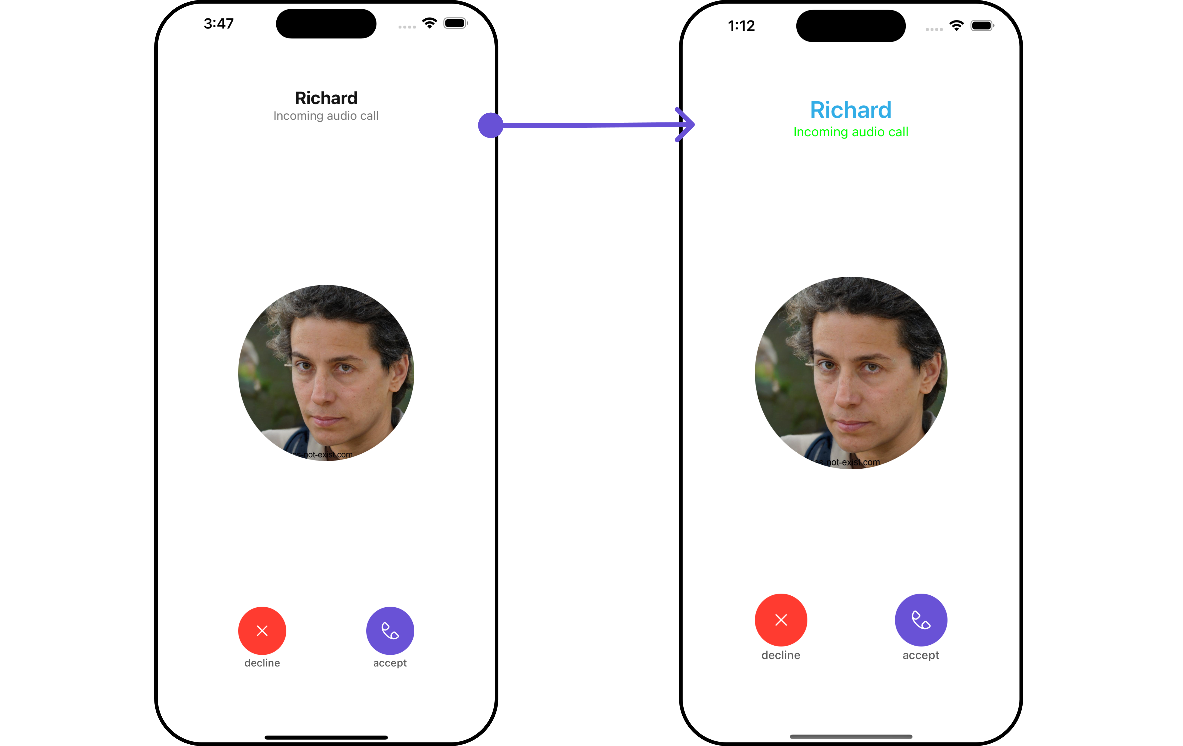
You can customize the appearance of the `IncomingCall` Component by applying the `IncomingCallStyle` to it using the following code snippet.
***
***
## Usage
### Integration
`CometChatIncomingCall` being a custom **view controller**, offers versatility in its integration. It can be seamlessly launched via button clicks or any user-triggered action, enhancing the overall user experience and facilitating smoother interactions within the application.
```swift theme={null}
let cometChatIncomingCall = CometChatIncomingCall().set(call: call)
cometChatIncomingCall.modalPresentationStyle = .fullScreen
self.present(cometChatIncomingCall, animated: true)
```
If you are already using a navigation controller, you can use the `pushViewController` function instead of presenting the view controller.
### Actions
[Actions](/ui-kit/ios/v4/components-overview#actions) dictate how a component functions. They are divided into two types: Predefined and User-defined. You can override either type, allowing you to tailor the behavior of the component to fit your specific needs.
##### 1. SetOnAcceptClick
The `setOnAcceptClick` action is typically triggered when the user clicks on the accept button, initiating a predefined action. However, by implementing the following code snippet, you can easily customize or override this default behavior to suit your specific requirements.
```swift theme={null}
let cometChatIncomingCall = CometChatIncomingCall()
.setOnAcceptClick(onAcceptClick: { call, controller in
//Perform Your Action
})
```
##### 2. SetOnCancelClick
The `setOnCancelClick` action is typically triggered when the user clicks on the reject button, initiating a predefined action. However, by implementing the following code snippet, you can easily customize or override this default behavior to suit your specific requirements.
```swift theme={null}
let cometChatIncomingCall = CometChatIncomingCall()
.setOnCancelClick(onCancelClick: { call, controller in
//Perform Your Action
})
```
##### 3. OnError
You can customize this behavior by using the provided code snippet to override the `On Error` and improve error handling.
```swift theme={null}
let incomingCallConfiguration = IncomingCallConfiguration()
.setOnError (onError:{ error in
//Perform Your Action
})
```
***
### Filters
**Filters** allow you to customize the data displayed in a list within a Component. You can filter the list based on your specific criteria, allowing for a more customized. Filters can be applied using RequestBuilders of Chat SDK.
The IncomingCall component does not have any exposed filters.
***
### Events
[Events](/ui-kit/ios/v4/components-overview#events) are emitted by a `Component`. By using event you can extend existing functionality. Being global events, they can be applied in Multiple Locations and are capable of being Added or Removed.
Events emitted by the Incoming Call component is as follows.
| Event | Description |
| -------------------------- | -------------------------------------------------------------------------- |
| **onIncomingCallAccepted** | Triggers when the logged-in user accepts the incoming call. |
| **onIncomingCallRejected** | This event is triggered when the logged-in user rejects the incoming call. |
| **onCallEnded** | This event is triggered when the initiated call successfully ends. |
```swift theme={null}
// View controller from your project where you want to listen events.
public class ViewController: UIViewController {
public override func viewDidLoad() {
super.viewDidLoad()
// Subscribing for the listener to listen events from user module
CometChatCallEvents.addListener("UNIQUE_ID", self as CometChatCallEventListener)
}
}
// Listener events from user module
extension ViewController: CometChatCallEventListener {
func onIncomingCallAccepted(call: Call) {
// Do Stuff
}
func onIncomingCallRejected(call: Call){
// Do Stuff
}
func onCallEnded(call: Call) {
// Do Stuff
}
}
```
```swift Emitting Group Events theme={null}
//emit this when logged in user accepts the incoming call
CometChatCallEvents.emitOnIncomingCallAccepted(call: Call)
//emit this when logged in user rejects the incoming call
CometChatCallEvents.emitOnIncomingCallRejected(call: Call)
//emit this when logged in user cancels a call
CometChatCallEvents.emitOnCallEnded(call: Call)
```
***
```swift View controller theme={null}
public override func viewWillDisappear(_ animated: Bool) {
// Uncubscribing for the listener to listen events from user module
CometChatCallEvents.removeListener("LISTENER_ID_USED_FOR_ADDING_THIS_LISTENER")
}
```
***
## Customization
To fit your app's design requirements, you can customize the appearance of the conversation component. We provide exposed methods that allow you to modify the experience and behavior according to your specific needs.
### Style
Using Style you can customize the look and feel of the component in your app, These parameters typically control elements such as the color, size, shape, and fonts used within the component.
##### 1. IncomingCall Style
You can customize the appearance of the `IncomingCall` Component by applying the `IncomingCallStyle` to it using the following code snippet.
 ```swift theme={null}
let incomingCallStyle = IncomingCallStyle()
.set(titleColor: .systemCyan)
.set(background: .orange)
.set(borderColor: .red)
.set(borderWidth: 4)
.set(subtitleColor: .green)
.set(titleFont: .boldSystemFont(ofSize: 27))
let cometChatIncomingCall = CometChatIncomingCall()
.set(user: user)
.set(incomingCallStyle: incomingCallStyle)
```
List of properties exposed by IncomingCallStyle
| Property | Description | Code |
| --------------------- | ------------------------------------------ | ------------------------------------------ |
| **set Background** | Sets the background color for IncomingCall | `.set(background: UIColor)` |
| **set CornerRadius** | Sets the corner radius for IncomingCall | `.set(cornerRadius: CometChatCornerStyle)` |
| **set BorderWidth** | Sets the border width for IncomingCall | `.set(borderWidth: CGFloat)` |
| **set BorderColor** | Sets the border color for IncomingCall | `.set(borderColor: UIColor)` |
| **set TitleColor** | Sets the title color for IncomingCall | `.set(titleColor: UIColor)` |
| **set TitleFont** | Sets the title font for IncomingCall | `.set(titleFont: UIFont)` |
| **set SubtitleColor** | Sets the subtitle color for IncomingCall | `.set(subtitleColor: UIColor)` |
| **set SubtitleFont** | Sets the subtitle font for IncomingCall | `.set(subtitleFont: UIFont)` |
##### 2. Avatar Styles
To apply customized styles to the `Avatar` component in the IncomingCall Component, you can use the following code snippet. For further insights on `Avatar` Styles [refer](/ui-kit/ios/v4/avatar#avatarstyle)
```swift Swift theme={null}
// Creating AvatarStyle object
let avatarStyle = AvatarStyle()
.set(background: .red)
.set(textFont: .systemFont(ofSize: 18))
.set(textColor: .systemTeal)
.set(cornerRadius: CometChatCornerStyle(cornerRadius: 8.0))
.set(borderColor: .systemBlue)
.set(borderWidth: 5)
.set(outerViewWidth: 3)
.set(outerViewSpacing: 3)
let cometChatIncomingCall = CometChatIncomingCall()
.set(user: user)
.set(avatarStyle: avatarStyle)
```
Ensure to pass and present `cometChatIncomingCall`. If a navigation controller is already in use, utilize the pushViewController function instead of directly presenting the view controller.
***
### Functionality
These are a set of small functional customizations that allow you to fine-tune the overall experience of the component. With these, you can change text, set custom icons, and toggle the visibility of UI elements.
**Example**
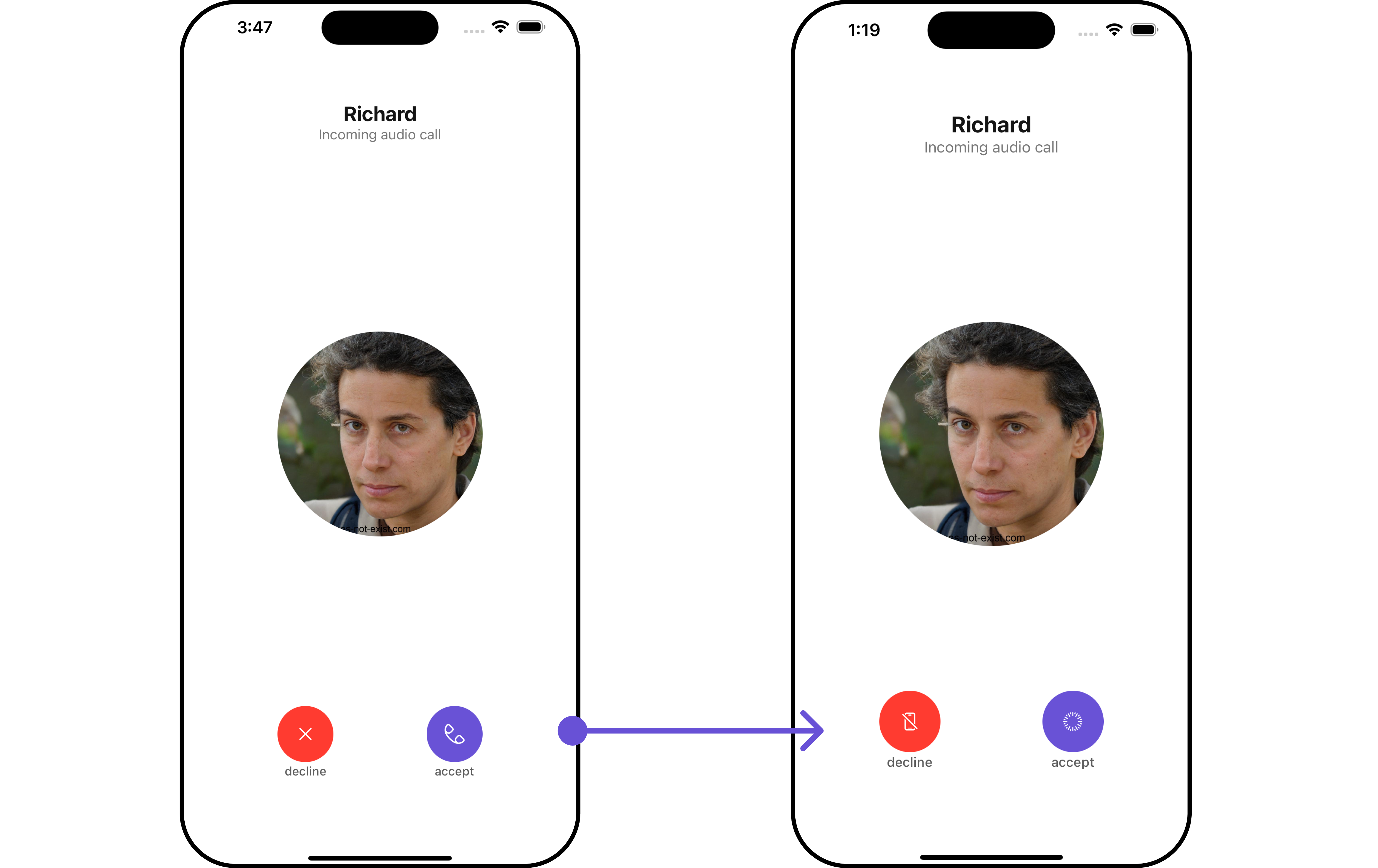
In this example, we're enhancing the interface by customizing the accept and decline button icons. By setting custom icons for both the accept and decline buttons, users can enjoy a more visually appealing and personalized experience.
This level of customization allows developers to tailor the user interface to match the overall theme and branding of their application.
```swift theme={null}
let incomingCallStyle = IncomingCallStyle()
.set(titleColor: .systemCyan)
.set(background: .orange)
.set(borderColor: .red)
.set(borderWidth: 4)
.set(subtitleColor: .green)
.set(titleFont: .boldSystemFont(ofSize: 27))
let cometChatIncomingCall = CometChatIncomingCall()
.set(user: user)
.set(incomingCallStyle: incomingCallStyle)
```
List of properties exposed by IncomingCallStyle
| Property | Description | Code |
| --------------------- | ------------------------------------------ | ------------------------------------------ |
| **set Background** | Sets the background color for IncomingCall | `.set(background: UIColor)` |
| **set CornerRadius** | Sets the corner radius for IncomingCall | `.set(cornerRadius: CometChatCornerStyle)` |
| **set BorderWidth** | Sets the border width for IncomingCall | `.set(borderWidth: CGFloat)` |
| **set BorderColor** | Sets the border color for IncomingCall | `.set(borderColor: UIColor)` |
| **set TitleColor** | Sets the title color for IncomingCall | `.set(titleColor: UIColor)` |
| **set TitleFont** | Sets the title font for IncomingCall | `.set(titleFont: UIFont)` |
| **set SubtitleColor** | Sets the subtitle color for IncomingCall | `.set(subtitleColor: UIColor)` |
| **set SubtitleFont** | Sets the subtitle font for IncomingCall | `.set(subtitleFont: UIFont)` |
##### 2. Avatar Styles
To apply customized styles to the `Avatar` component in the IncomingCall Component, you can use the following code snippet. For further insights on `Avatar` Styles [refer](/ui-kit/ios/v4/avatar#avatarstyle)
```swift Swift theme={null}
// Creating AvatarStyle object
let avatarStyle = AvatarStyle()
.set(background: .red)
.set(textFont: .systemFont(ofSize: 18))
.set(textColor: .systemTeal)
.set(cornerRadius: CometChatCornerStyle(cornerRadius: 8.0))
.set(borderColor: .systemBlue)
.set(borderWidth: 5)
.set(outerViewWidth: 3)
.set(outerViewSpacing: 3)
let cometChatIncomingCall = CometChatIncomingCall()
.set(user: user)
.set(avatarStyle: avatarStyle)
```
Ensure to pass and present `cometChatIncomingCall`. If a navigation controller is already in use, utilize the pushViewController function instead of directly presenting the view controller.
***
### Functionality
These are a set of small functional customizations that allow you to fine-tune the overall experience of the component. With these, you can change text, set custom icons, and toggle the visibility of UI elements.
**Example**
In this example, we're enhancing the interface by customizing the accept and decline button icons. By setting custom icons for both the accept and decline buttons, users can enjoy a more visually appealing and personalized experience.
This level of customization allows developers to tailor the user interface to match the overall theme and branding of their application.
 ```swift View controller theme={null}
import UIKit
import CometChatUIKitSwift
import CometChatSDK
import CometChatCallsSDK
class ViewController: UIViewController , CometChatCallDelegate{
func onIncomingCallReceived(incomingCall: CometChatSDK.Call?, error: CometChatSDK.CometChatException?) {
let cometChatIncomingCall = CometChatIncomingCall()
.set(acceptButtonIcon: UIImage(systemName: "timelapse")!)
.set(declineButtonIcon: UIImage(systemName: "iphone.slash")!)
.set(call: incomingCall!)
cometChatIncomingCall.modalPresentationStyle = .fullScreen
self.present(cometChatIncomingCall, animated: true)
}
```
If you are already using a navigation controller, you can use the pushViewController function instead of presenting the view controller.
Below is a list of customizations along with corresponding code snippets
| Property | Description | Code |
| -------------------------------------------------------------- | ---------------------------------------------------------- | ---------------------------------- |
| **title** | Sets the title for CometChatIncomingCall | `.set(title: String)` |
| **call** | Sets the user object for CometChatIncomingCall | `.set(call: Call?)` |
| **group** | Sets the group object for CometChatIncomingCall | `.set(group: Group)` |
| **disablesoundForCalls** | Disables sound for calls | `.disable(soundForCalls: Bool)` |
| **customSoundForCall** | Sets custom sound for calls | `.set(customSoundForCalls: URL?)` |
| **acceptButtonText** 🛑 | Sets the text for accept button for CometChatIncomingCall | `.set(acceptButtonText: String)` |
| **acceptButtonIcon** | Sets the icon for accept button for CometChatIncomingCall | `.set(acceptButtonIcon: UIImage)` |
| **declineButtonIcon** | Sets the icon for decline button for CometChatIncomingCall | `.set(declineButtonIcon: UIImage)` |
### Advanced
For advanced-level customization, you can set custom views to the component. This lets you tailor each aspect of the component to fit your exact needs and application aesthetics. You can create and define your views, layouts, and UI elements and then incorporate those into the component.
The `IncomingCall` component does not provide additional functionalities beyond this level of customization.
***
***
```swift View controller theme={null}
import UIKit
import CometChatUIKitSwift
import CometChatSDK
import CometChatCallsSDK
class ViewController: UIViewController , CometChatCallDelegate{
func onIncomingCallReceived(incomingCall: CometChatSDK.Call?, error: CometChatSDK.CometChatException?) {
let cometChatIncomingCall = CometChatIncomingCall()
.set(acceptButtonIcon: UIImage(systemName: "timelapse")!)
.set(declineButtonIcon: UIImage(systemName: "iphone.slash")!)
.set(call: incomingCall!)
cometChatIncomingCall.modalPresentationStyle = .fullScreen
self.present(cometChatIncomingCall, animated: true)
}
```
If you are already using a navigation controller, you can use the pushViewController function instead of presenting the view controller.
Below is a list of customizations along with corresponding code snippets
| Property | Description | Code |
| -------------------------------------------------------------- | ---------------------------------------------------------- | ---------------------------------- |
| **title** | Sets the title for CometChatIncomingCall | `.set(title: String)` |
| **call** | Sets the user object for CometChatIncomingCall | `.set(call: Call?)` |
| **group** | Sets the group object for CometChatIncomingCall | `.set(group: Group)` |
| **disablesoundForCalls** | Disables sound for calls | `.disable(soundForCalls: Bool)` |
| **customSoundForCall** | Sets custom sound for calls | `.set(customSoundForCalls: URL?)` |
| **acceptButtonText** 🛑 | Sets the text for accept button for CometChatIncomingCall | `.set(acceptButtonText: String)` |
| **acceptButtonIcon** | Sets the icon for accept button for CometChatIncomingCall | `.set(acceptButtonIcon: UIImage)` |
| **declineButtonIcon** | Sets the icon for decline button for CometChatIncomingCall | `.set(declineButtonIcon: UIImage)` |
### Advanced
For advanced-level customization, you can set custom views to the component. This lets you tailor each aspect of the component to fit your exact needs and application aesthetics. You can create and define your views, layouts, and UI elements and then incorporate those into the component.
The `IncomingCall` component does not provide additional functionalities beyond this level of customization.
***
***